• Do not use Discord to host any images you post, these links expire quickly! You can learn how to add images to your posts here.

Released Pokemon Nova

This project has a release available. The full version is still a work in progress.
Nova%20logo_zpsbip2e953.png
Introduction:
Pokemon Nova is a fan game created by myself using Pokemon Essentials & RPG Maker XP.
I wanted to create a game which reminded me the original RBY games but with updated graphics, mechanics and my very own Fakemon.

Plot:
The player moves to a new region known as the Mahalo Region. Upon arival the player meets of the lab assistants who invites you to the lab. As from there on out the game starts up and the player must travel across the region, catching and training Pokemon. Testing their battling skills against the 8 Gym Leaders of the region to one day challenge the Mahalo Elite 4.

Along the way you will meet various characters, both friends or foes. And in true Pokemon fashion, be the kid who may have to save the world from an evil team!

Features:
- Over 200 Fakemon
- Mega Evolution
- Edited 3rd Generation graphics
- New Moves and also moves that have featured from later generations i.e Leafage.
- No HMs
- 2 Rivals
- 8 Gym Leaders and Elite 4
- "Evil" Team
- Choice in the story which can lead the player down two routes

Progress:
The original version has all 8 Gyms, and Elite 4 but is missing the story due to me wanting to revamp the region. However because of this I have a clear plan of how the game will go and so I can quickly progress with updates and such.
So far I have re mapped the region and there is now:
- 7 Towns
- 3 Gyms
- 8 Routes
+ a few extra like caves, forests, etc...
The Demo stops just after route 8 but I am working on getting to a few new gyms for the next update.

I tend to update with screenshots/Images/Maps on my twitter page:
https://twitter.com/PKMN_Nova

Please note that this is a very early version of the project and things are set to change.

Screenshots:
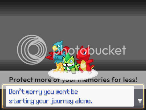
The starters are slightly different now and I will get a new screenshot of the three of them very soon.
starters_zpsefpxz64l.png
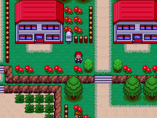
New%20Tide%20Twon_zpswvttu5cu.png
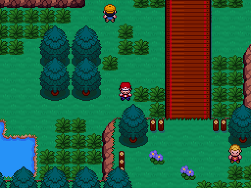
Route%203_zpse8kalz65.png
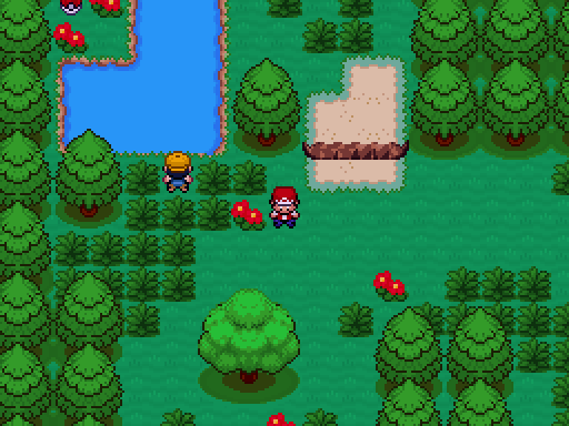
Hokua%20Forest_zpsch7yy3da.png
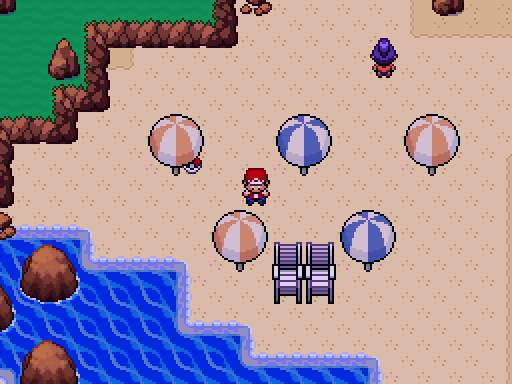
Huia%20Beach_zps7hyw2s8k.png
Battle%20Market_zpskqqs6cit.png


Playthrough:
Here is a previous version of the game, some maps have now been edited to look better.


Download Link:
Pokemon Nova Download

Credits:
Fakemon Design, Tileset edits, character sprites:
- Charizardthree - https://www.youtube.com/charizardthree

Pokémon Essentials Starter Kit:
- Maruno
- Poccil
- Flameguru
 
Last edited:

Djaco75

MasterMind
Member
Joined
Apr 19, 2017
Posts
122
The game looks really, really good so far. A couple of things I picked up on.

  • The tilesets look amazing. I love the effects and style you've added to them. They look so much more engaging to the player.
  • I really like the starters! I think they're creative and look really good.
  • I also like the fact you can choose two paths to play. It will make the game all the more playable.
  • I picked up a few spelling errors in the screenshots and the Youtube Video. While it's not a critical issue, I believe they should be fixed.
  • I know you said something about mirroring the Kanto Region, but the house maps look almost identical to the ones from Kanto and the Professor's sprite looks the same too.
  • Lastly, in the video, the indoor maps weren't edited like the outside ones graphic wise. I think this looks inconsistent and would look heaps better if they were given the same artistic touch.

Well, that's all and I hope you can benefit from my feedback. I hope the rest of the game goes well. Good Luck!
 

Charizardthree

Elite Trainer
Member
Joined
Apr 25, 2017
Posts
268
The game looks really, really good so far. A couple of things I picked up on.

  • The tilesets look amazing. I love the effects and style you've added to them. They look so much more engaging to the player.
  • I really like the starters! I think they're creative and look really good.
  • I also like the fact you can choose two paths to play. It will make the game all the more playable.
  • I picked up a few spelling errors in the screenshots and the Youtube Video. While it's not a critical issue, I believe they should be fixed.
  • I know you said something about mirroring the Kanto Region, but the house maps look almost identical to the ones from Kanto and the Professor's sprite looks the same too.
  • Lastly, in the video, the indoor maps weren't edited like the outside ones graphic wise. I think this looks inconsistent and would look heaps better if they were given the same artistic touch.

Well, that's all and I hope you can benefit from my feedback. I hope the rest of the game goes well. Good Luck!


Thanks for the feed back, Glad you like the starters and tileset.
This was the first release of the "Demo" so I was expecting to have a few spelling errors (not as many but still), I'm currently going through and fixing them all now.
The indoor maps I will update at some point, I just wanted something I could use for now but now that it has been pointed out I'll get to work on it asap.
The playthrough is actually the previous version of the game, I just left it on as a showcase as to what you can expect. A few of the maps have now been updated which includes buildings as well. For example; the new homes are shown in the second screen shot. I'll have to update that playthrough when I have some free time.
 

qnibru

double knight
Member
Joined
Apr 17, 2017
Posts
11
Hey !
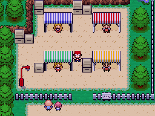
I just want to give you a tip for sprites and tiles, you should remove the black color.
See the starters. The fire and the water ones looks great, but the black on the grass one is weird.
Same for the beach umbrella.
 
I'd literally recommend the exact opposite. In the official games, the Pokemon sprites always have a mostly black outline, with bit on a darker shade of what ever colour the Pokemon is where the light would hit it most. Not only are the sprites (other than the grass starter) not in the style of the official sprites, I also think they aren't really too visually appealing with just a coloured outline. I think that generally the sprites themselves are okay, it's just the outlines that I think need to be changed a bit.

I also think that generally, your tiles are way too bright. I try lowering the saturation, because at the moment I think they're way too bright and distracting.
 

Charizardthree

Elite Trainer
Member
Joined
Apr 25, 2017
Posts
268
Hey !
I just want to give you a tip for sprites and tiles, you should remove the black color.
See the starters. The fire and the water ones looks great, but the black on the grass one is weird.
Same for the beach umbrella.

I'd literally recommend the exact opposite. In the official games, the Pokemon sprites always have a mostly black outline, with bit on a darker shade of what ever colour the Pokemon is where the light would hit it most. Not only are the sprites (other than the grass starter) not in the style of the official sprites, I also think they aren't really too visually appealing with just a coloured outline. I think that generally the sprites themselves are okay, it's just the outlines that I think need to be changed a bit.
I also think that generally, your tiles are way too bright. I try lowering the saturation, because at the moment I think they're way too bright and distracting.

Thank you both for your feedback. Even though both opinions are opposite, I'll take that my tiles/sprites need work and will definitely mess around with them slightly so that they may be more appealing. I'm still trying to improve the graphics and trying to find my own real style for the game. So hopefully the end result will be something that you will both think is good
 
In your features list, you have "No HMs" as one of them. Are you replacing HMs with a different system, or removing them entirely? And if you're removing them, what are your plans for player roadblocks?

I haven't had time to give the demo a shot (will in the future), but I'm curious how you're handling the above.
 

Charizardthree

Elite Trainer
Member
Joined
Apr 25, 2017
Posts
268
In your features list, you have "No HMs" as one of them. Are you replacing HMs with a different system, or removing them entirely? And if you're removing them, what are your plans for player roadblocks?

I haven't had time to give the demo a shot (will in the future), but I'm curious how you're handling the above.

The Idea was to remove HMs completely, I'm considering keeping Surf but just as a general move like SM. It won't be needed to progress in the story.
Roadblocks are just going to be done in different ways like events that block paths and will clear after you've completed different points of the game.
i.e. characters clearing Rock slides until you've taken on the evil team.
I just don't want the player to be put out of their way because they don't have a certain move.

As the demo is short it doesn't really show off this too much but as I get a little bit further with the remodel and more story is accessible it will be more noticeable of how it will work within the game.
 
  • Like
Reactions: Deo

qnibru

double knight
Member
Joined
Apr 17, 2017
Posts
11
I'd literally recommend the exact opposite. In the official games, the Pokemon sprites always have a mostly black outline, with bit on a darker shade of what ever colour the Pokemon is where the light would hit it most. Not only are the sprites (other than the grass starter) not in the style of the official sprites, I also think they aren't really too visually appealing with just a coloured outline. I think that generally the sprites themselves are okay, it's just the outlines that I think need to be changed a bit.

I also think that generally, your tiles are way too bright. I try lowering the saturation, because at the moment I think they're way too bright and distracting.

You're right, but i found the starters' sprites smooth like that, so it's better to keep the same design chart.
 

NoodlesButt

Addicted to Jams
Member
Joined
Apr 2, 2017
Posts
55
I really like the fakemon, they're creative and different to how fakemon are usually designed.
Echo is my fave.
 

MasterBallz

x99
Member
Joined
Apr 1, 2017
Posts
15
The starters look like they are different styles like if ones a Pokemon ones a Digimon and one is from one of those Pokemon knock off apps on the google play store. Idk if the rest of the fakemon are like that but these just don't seem to gel well together especially the grass one with that outline.
 

Charizardthree

Elite Trainer
Member
Joined
Apr 25, 2017
Posts
268
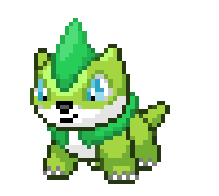
Just because people are commenting about it I feel I should make a post to say that the starters have been changed up slightly, the grass starter no loner has the black as the outline colour. I'll update the original post as well so people know.

grass%20starter%20no%20black%20outline_zpsztp1qeqq.png
------------------------
The starters look like they are different styles like if ones a Pokemon ones a Digimon and one is from one of those Pokemon knock off apps on the google play store. Idk if the rest of the fakemon are like that but these just don't seem to gel well together especially the grass one with that outline.

I'm going to take that you don't like the designs? How do you think I could make them better or do you just think I need to scrap them and make new ones?
As for the consistency in the sprites, I am working on getting them to all look decent. In the final or even the later releases I'll work on refining them all to the same style.
 
Last edited:

qnibru

double knight
Member
Joined
Apr 17, 2017
Posts
11
Just because people are commenting about it I feel I should make a post to say that the starters have been changed up slightly, the grass starter no loner has the black as the outline colour. I'll update the original post as well so people know.

grass%20starter%20no%20black%20outline_zpsztp1qeqq.png
------------------------

I'm going to take that you don't like the designs? How do you think I could make them better or do you just think I need to scrap them and make new ones?
As for the consistency in the sprites, I am working on getting them to all look decent. In the final or even the later releases I'll work on refining them all to the same style.

Better !
But know, you should outline with not black the other starters.
 

Djaco75

MasterMind
Member
Joined
Apr 19, 2017
Posts
122
Just because people are commenting about it I feel I should make a post to say that the starters have been changed up slightly, the grass starter no loner has the black as the outline colour. I'll update the original post as well so people know.

grass%20starter%20no%20black%20outline_zpsztp1qeqq.png
------------------------

I'm going to take that you don't like the designs? How do you think I could make them better or do you just think I need to scrap them and make new ones?
As for the consistency in the sprites, I am working on getting them to all look decent. In the final or even the later releases I'll work on refining them all to the same style.

So are you ditching the black outline for the grass sprite or adding it to the other two starters? Personally, I think the outline is fine - it's just the inconsistency that's the problem.
 

Charizardthree

Elite Trainer
Member
Joined
Apr 25, 2017
Posts
268
So are you ditching the black outline for the grass sprite or adding it to the other two starters? Personally, I think the outline is fine - it's just the inconsistency that's the problem.

I took the black outline from the grass starter, I will do a similar thing with the other two though and have a darker second colour outline. I think that's how im going do the rest of my sprites from here on out. I know it's not true to the Pokemon series format but it's a decision i'm going with
 
Last edited:

Charizardthree

Elite Trainer
Member
Joined
Apr 25, 2017
Posts
268
Updated the Demo for Pokemon Nova.

There are now:
- 3 Gyms
- 6 Towns
- 8 Routes
- New characters/Fakemon have been added.

Note that this is an early release so there maybe bugs. Please save regularly just in case I have missed these bugs. If anything comes up please do let me know :)

I have updated the original post with the new Download link:
https://www.dropbox.com/s/b5sbh809uvc95gt/Pokemon Nova Demo V2.1.rar?dl=0
 

TheGamingPaladin

TheGamingPaladin - Youtuber, Foodie, Gamer 4 Life
Member
Joined
Apr 19, 2017
Posts
105
looks like a good fan game in the making, i was wondering though how many original pokemon from the official games will be joining your fakemon?

or is it all fakemon?
 

MadDeodorant

Insert internet reference here
Member
Joined
Apr 1, 2017
Posts
52
Hey, loving the game so far. But the fisherman that gives you the old rod doesn't actually give it to you. You get an error and the game quits. Might want to fix that.
 
Back
Top