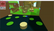
• Do not use Discord to host any images you post, these links expire quickly! You can learn how to add images to your posts here.

Released Go Go Beasts!

This project has a release available. The full version is still a work in progress.
GoGoBeasts_AltMenu.gif

Go Go Beasts!

Go Go Beasts is a First-Person Monster Capture Platformer!
Inspired by Pokémon, Banjo-Kazooie, and Neon White!

Protag_M_0.png
Protag_F_2.png

GoGoGameplay_1.gif

Capture various unique Go Go Beasts to gain new movement abilities!
Beast_0.png
Beast_2.png
Beast_4.png

Evolve your Go Go Beasts to gain even more advanced abilities!
Beast_1.png
Beast_3.png
Beast_5.png

GoGoGameplay_2_Alt.gif

Meet a colorful cast of characters on the various isles of the Azure Archipelago!
NPC_Kaz.png
NPC_Painter.png
NPC_MisterMine.png
NPC_MoneyMan.png
NPC_Nina.png
NPC_Professor_Shmoove.png

Explore the 3 primary islands: Verdant Isle, Fortune Isle, and Industry Isle!
1677063318011.png
1677064086766.png

1677064139551.png
1677064214218.png

1677064685767.png
1677465140584.png

1677065319117.png
1677464185010.png

Game Length:
Roughly 1-2 hours

Team:
Thundaga - Lead Developer
Tristantine The Great - Writing Support and Playtesting


Made With:
Unity


Notes:
This was a ton of fun to work on and I learned a ton!
I eventually would like to turn Go Go Beasts into a full game on Steam, so please send me any and all feedback/bugs/ideas you have!
If you beat the game, I love ya!

Also, if you draw any fanart of the characters or beasts and send it to me, I will put it in the game!

All of my project files at the time of jam submission are here!
Feel free to dig through all my maps and code to learn stuff about Unity!

1. Cheerful Forest - Verdant Isle
2. Golden Desert - Fortune Isle
3. Bustling City - Industry Isle

Music Used:
Everybody's Golf 6
Persona 5 Strikers

Shoutouts to the Thundafam and Thundagang! Love y'all!
 
Last edited:

Sulucnal

Novice
Member
Joined
Sep 7, 2020
Posts
13
Ok, for some reasons the speedrun panel worked now. I'll have to try to see if it's not something that happens when you make multiple runs back to back without relaunching the game or something, but it's getting too late for me to do it today, so I'll try to it again tomorrow.

For the new beasts drawing, they're just joke placeholders I put here for the sake of illustration, but thanks.

I also thought that it could be nice to add an option "show timer" to have a timer constantly displayed somewhere on your screen during a run.

And by the way, not to flex, but...
speedrun time.png


By the way, I thought that you said on stream that the golden crown was only for the people with a sub 15. Is it normal for me to have it here? And I don't have time to verify, but is my time normal? Because getting 15:30 while my video is over 23 mins seems kinda weird, even if the time spent in the pause menu isn't counted.
 
Last edited:
Ok, for some reasons the speedrun panel worked now. I'll have to try to see if it's not something that happens when you make multiple runs back to back without relaunching the game or something, but it's getting too late for me to do it today, so I'll try to it again tomorrow.

For the new beasts drawing, they're just joke placeholders I put here for the sake of illustration, but thanks.

And by the way, not to flex, but...

That's some damn good shmoovement! A much better time than mine! There might be a bug here I need to look into, since the discrepancy between the video time and the recorded playtime value has my eyebrows raising a bit! I know I'm tracking in-game time (unpaused) but a 24:51 video with a final in-game playtime of 15:30 feels off somehow! You do also show the medal at the start and that has a previous time of 52:12... Hmm, it's a weird one! I wish I could've seen the talk you had with Cam at the end, since he says your current playthrough time as well as your best time! I should probably update it, so he always mentions both values, since that will also help with testing and general clarity! Perhaps I'm tripping about the time and you're a master of the shmoovement as well, I can't ignore that possibility!

I hope you had fun speedrunning too! I want to give it a couple more tries myself sometime soon! I want GGB to be a game with a lot of different speedrun possibilities and routes!
 
100%'d the game! I had a blast!

Here are all of my thoughts on the game -
  • This game really felt like a combination of GG2, Doodle and Paranormal. It had charming dialogue, cute graphics, fun music/sfx, and of course, the shmoovement. You have such a unique and distinct style!
  • The movement felt really good. I loved the schewww sound effect and dash particles. I enjoyed comboing my dashes and jumps, especially when there were lots of Dimbus' around.
  • I liked the lighting and fog you added to the environments. I also liked the funny cloud shapes.
  • I loved how a lot of the graphics were 'bouncing'. Like the title screen images, the professor in the intro and even the beasts in the equipped slots.
  • At first, I was worried that I would be using the same two secondary beasts (Triflap and Dasherfly) for the whole playthrough, but the other beasts were actually really useful in certain situations, such as using Widgeon in the museum or using Callie in the city speedrun.
  • The gameplay reminded me of Mario Odyssey. There were so many different things to do and areas to explore, the game never felt boring. I loved how I could freely switch and change movement styles, experiment with different beast combinations and explore wherever and whenever I wanted.
  • You added a lot of helpful things to the game, which made it much less frustrating to play. For example, Tipster was super helpful for finding relics, and Trazure was great for finding coins. Really good game design!
  • The speed runs were challenging but super fun.
  • Loved the art in the museum.
My favourite beast designs: Letty, Chubgeon, Dimbus
  • The bars that display the number of dashes and jumps could benefit from being bigger and more visible. Perhaps even somewhere in the centre of the screen, so the player can see it while shmooving.
  • I wanted to see the beast's abilities without going into the dex or equipping them. Perhaps the description could show up if you hover over the beast in the equip menu, or something like Sulucnal's beast selection UI.
  • I found the text speed to be a bit slow, and I wished I could skip the text playback by pressing e. Currently, pressing e during text playback skips to the next line of dialogue instead.
  • Beasts with no abilities didn't feel as satisfying to catch. I fully agree with Sulucnal's idea about adding stat modifiers to these beasts. I think it would make them more worth catching!
  • I may not have been paying attention, but sometimes I would miss a beast evolution. Maybe you could add a unique sound effect or visual effect for that too.
  • It seemed like the player's level didn't have much impact on the game beyond unlocking speed runs. I liked the level-up jingle and effect, though!
  • Some of the text in the tutorial was a little long and confusing, especially for Groakus. I think that sign introduced too many new concepts. More diagrams might help.
  • The red lighting in the museum was a bit intense and distracting!
I would like to see more -
  • Speedrun challenges! They really put my skills to the test and were my favourite part of the game.
  • World-building and story. I enjoyed the small stories in each Isle (e.g. Yarid Town, Umbra Corps etc.), but I think having a bigger overall story would be cool too!
  • Unique relic challenges and puzzles.
  • Primary beasts, and secondary beasts that do more than just enhance dashes/jumps.
I spent quite a bit of time speedrunning the Verdant Isle one. I used Woggy, Rodrage and Dasherfly. I'm interested to see your speed run times 👀

gogobeaststotals.png
Overall, this was a really impressive jam game. Paranormal was a great Unity game, but GGB was definitely a big improvement. I could tell you learnt a lot during this jam! Go Go Beasts will for sure be in my steam library when you release it. Nice work, Thundaga & Tristantine!
 
Last edited:

Sulucnal

Novice
Member
Joined
Sep 7, 2020
Posts
13
Yes, I checked my video back and without the pauses, loading and dialogues, my time should be around 23:09. I'll try to record a new run and talk to Cam at the end to see what he has to say. And by the way, do the dialogues count in the time?

Edit: My new run. Cam and the panel in the player's house say that I'm at 11:52 while my video is almost at 25 mins and I'm absolutely sure that I didn't spend more than 3 minutes in menus, loading screens and dialogues.

(I didn't choose to use this thumbnail but this one is way better than anything I could come up with)
 
Last edited:
Yes, I checked my video back and without the pauses, loading and dialogues, my time should be around 23:09. I'll try to record a new run and talk to Cam at the end to see what he has to say. And by the way, do the dialogues count in the time?

Edit: My new run. Cam and the panel in the player's house say that I'm at 11:52 while my video is almost at 25 mins and I'm absolutely sure that I didn't spend more than 3 minutes in menus, loading screens and dialogues.

(I didn't choose to use this thumbnail but this one is way better than anything I could come up with)

Interesting... I need to look further into how the time is calculated in that case! I'll work on an update tonight that displays the value in the Pause Menu (with the option to toggle it) so we can get to the bottom of it! My theory is that it's somewhat influenced by framerate, but I could totally be wrong about that too lol! In 1.0.5 I made change so that it tracks Time.unscaledDeltaTime instead of Time.deltaTime, which means it now advances time when your game is paused, so the only time it's stopped is in the Intro Scene, World Map, and Main Menu now! I think FixedDeltaTime may be the key since thats not framerate influenced? 🤔 The Main Menu Options now also allows you to wipe the speedrun time, which can help with testing as well!

Dialogue does advance the time for reference, since the world is unpaused during dialogue! Time advances now even when the game is paused too actually!

PS: Love the auto thumbnail lol!
 
Last edited:

Sulucnal

Novice
Member
Joined
Sep 7, 2020
Posts
13
Bug: It doesn't happen all the time so I unfortunately can't tell you how to reproduce this bug, but sometimes when you use the world map to go somewhere, the primary ability action will use itself automatically every time the bar is full and you'll only stop using it once you left click again.

Bug: The hitbox of the roofs of shmoovingtown seem to be a little to large in some places, making you able to float in the air if you stand slightly next to them. Plus, the model looks weird in one of the corners of the lab. (Edit: It's also the case for the logs in verdant isle and probably some other things in the game, which makes me believe that the problem isn't from the hitboxes of all of those models, but from the player's hitbox itself bieng just a little too large)
lab_roof_front.png

model lab roof.png

Bug: I got the "<=22" medal while my time was <=23 (22:58).

Bug: In Verdant Isle, looking at the Beasts above the water in a certain way can make the color of the water "merge" with the color of the Beast. I think that it also happens with the red walls from the trial at the fourth checkpoint in Fortune Isle.
monsters water.png

Bug: Using the right monsters, you can go anywhere you want, like extremely high up, to the speedrun zones without having to reach the levels to have access to the teleporters or to the zone whith the Beast #52 without having to touch a single Dimbus.

Shoomingtown Up.png


Bug?: I don't really know if it's a problem, but in Verdant Isle, since the "barkless" (I don't know how to say it otherwise) part of the logs goes a little higher than the end of the bark, it is possible to go on top of the bark and be unable to move on to the barkless part without jumping (I don't know if I was really clear there).

Feature: You could add a checkbox in the settings like "Launch new game in speedrun mode" that would make a timer constantly appear somewhere on your screen and only disappear once you speak to Cam on Dev Isle. It'd make it easier to get an idea of our current time without having to pause the game every single time.

Change: You could also edit Cam's dialogue because the transition between him talking about your speedrun time and him thanking you for playing sounds kinda weird as it is now.

Change: I don't really know how to explain it, but even if I agree with Kenny about the red lighting in the museum being intense in the previous versions, I still feel like there is something wrong with the new ones, they're kinda confusing. I can't really tell what makes them confusing, they just are for some reasons.
 

Attachments

  • 1678034746128.png
    1678034746128.png
    622 KB · Views: 89
Last edited:
Bug: It doesn't happen all the time so I unfortunately can't tell you how to reproduce this bug, but sometimes when you use the world map to go somewhere, the primary ability action will use itself automatically every time the bar is full and you'll only stop using it once you left click again.

Bug: The hitbox of the roofs of shmoovingtown seem to be a little to large in some places, making you able to float in the air if you stand slightly next to them. Plus, the model looks weird in one of the corners of the lab. (Edit: It's also the case for the logs in verdant isle and probably some other things in the game, which makes me believe that the problem isn't from the hitboxes of all of those models, but from the player's hitbox itself bieng just a little too large)

Bug: I got the "<=22" medal while my time was <=23 (22:58).

Bug: In Verdant Isle, looking at the Beasts above the water in a certain way can make the color of the water "merge" with the color of the Beast. I think that it also happens with the red walls from the trial at the fourth checkpoint in Fortune Isle.

Bug: Using the right monsters, you can go anywhere you want, like extremely high up, to the speedrun zones without having to reach the levels to have access to the teleporters or to the zone whith the Beast #52 without having to touch a single Dimbus.


Bug?: I don't really know if it's a problem, but in Verdant Isle, since the "barkless" (I don't know how to say it otherwise) part of the logs goes a little higher than the end of the bark, it is possible to go on top of the bark and be unable to move on to the barkless part without jumping (I don't know if I was really clear there).

Feature: You could add a checkbox in the settings like "Launch new game in speedrun mode" that would make a timer constantly appear somewhere on your screen and only disappear once you speak to Cam on Dev Isle. It'd make it easier to get an idea of our current time without having to pause the game every single time.

Change: You could also edit Cam's dialogue because the transition between him talking about your speedrun time and him thanking you for playing sounds kinda weird as it is now.

Change: I don't really know how to explain it, but even if I agree with Kenny about the red lighting in the museum being intense in the previous versions, I still feel like there is something wrong with the new ones, they're kinda confusing. I can't really tell what makes them confusing, they just are for some reasons.

Thank you again for all the bug reports! Looks like I got some more tweaks to make haha! A note about the speedrun time though, it tracks based on the minute, so that's technically not a bug! Time <= 22.58 is technically = 22, not = 23 😅 I admit it's definitely a bit confusing as is so I can address that as well!
 
Last edited:

Sulucnal

Novice
Member
Joined
Sep 7, 2020
Posts
13
First of all, I'm too lazy to do a complete run today to test the new "Toggle speedrun modeé button. However, I feel like you should change it to a checkbox or something like that since it is currently hard to know when this feature is and isn't activated as it is right now.

And now for the bug/ideas:
The texture are stretching in a weird way on top of the challenge area associated with chekpoint 4.
texture scaling fortune isle u challenge.png
The red damaging areas of the pyramid in Fortune Isle doesn't work anymore.
Jumping will walking towards a steep slope (like trees for example) with Triflap will trigger all of his jumps even though the spacebar is only pressed once.

The fact that the pointy part at the bottom of Verdant Isle and Fortune Isle don't have collisions make you able to see through them.


The player isn't happy when there isn't enough space for him to jump and will force you to jump continuously until you get unstuck.

You can regain your jump charges when you collide with some parts of the map using Embird/Pyrix(I was too lazy to test it out, but I guess that it can happen anywhere you have two meshes on top of each other, which makes your character think that it touched the floor when it reaches the top of the first mesh in a certain way). It also works when you collide with the danger/poison sign at the entrance of the area of checkpoint 4 in Verdant Isle, or on the buildings from Industry Isle (making you able to climb them pretty easily).


Your shadow does some weird stuff when you stand on top of a computer.
shadow computer.png

If you look at the distance on my Glimmer Radar, you can see that the Glimmer changes every time I respawn. The number of Glimmers stays the same though.

I watched the vod of your stream were you played Holly Goes to the F*cking Lake and DISCARDED and thought about some of the things you said regarding GoGoBeasts at the end of the stream.
At around the 3h25min mark, you talked about the fact that getting all the coins could be a hassle. My opinion on it is that even though I don't mind trying to collect every single coin in the different levels, once you get enough to buy the relics necessary in each world, you still have 175 useless coins that are nothing more than a number in the pause menu. Maybe you could add a way to spend them that wouldn't be necessary to complete the game at 100% and wouldn't affect the gameplay at all. We can think about some cosmetic stuff like buying skins for your primary monsters or new furnitures for the player's house.
At around the 3h25min mark, you talked about the ckeckpoints and wanting to have 5 checkpoints per world placed in front of the challenges areas. In Fortune Isle, there is technically two "parkour challenges" (if you can call it that way): The first one being that kind of U-shaped tunnel at checkpoint 4 and the second one being the pyramid. So I was wondering: Why is the fourth checkpoint placed where it is? I understand that those two challenges are pretty close to each other, but the Pyramid can still be tricky and you can still have to retry a few times (more than for the U-shaped tunnel), which can make the road between the fourth checkoint and the rock with the NPC that marks the beginning of the pyramid challenge pretty tedious. That's why I was thinking about two alternative ways to design the area. You could either:
  • Place the checkpoint 4 at a midpoint between the two challenges, or...
  • rearrange the level to make the two challenges closer to each other (like in the professionnaly drawn schematic below)
challenge four fortune isle alt layout.png
At around the 3h33min mark, you mentionned adding a cost to the secondary beasts and the ability to equip more secondary beasts at once. I like the idea, but my concern is now about being able to show all of your equipped monsters on your HUD without making it take too much screen space. Do you have a solution for it?
Once the game has it's final soundtrack, you could add a jukebox in the player's house to let them listen to all of the musics the have encountered yet whenever they want.
 
Last edited:
Go Go Beasts v1.0.8 has been uploaded! Even more bugfixes and QOL updates! Thank you so much again Sulucnal!

To answer the question about secondary beasts, I was definitely thinking of revising the Equip Beasts menu and potentially changing the HUD to hide the secondaries, but we'll see how that goes in a much later update! We can talk about that plan and more in the DMs and on Discord too, I'll add you!
 

Nandthesword

Cooltrainer
Member
Joined
Jan 4, 2022
Posts
115
Just 100%'d the game! I don't think this game has gotten enough praise honestly, the game structure was so good! Like said in Kenny's praise, the gameplay never felt boring and there always felt like there was so much to do! I really enjoyed how this was a fun and fresh experience, especially since you made it in Unity in such a short amount of time!

Mad respect to both of y'all for making this! I'll be looking out for updates! 😄😄
 

CelestialFearow

Venipede User
Member
Joined
Jul 24, 2020
Posts
200
You should add a option to lock FPS cause the game run at 1 000 000 000 fps, and my cpu don't like that :(
I can't play it cause of that
 

AenaonDogsky

Arbiter of Doggos
Member
Joined
Dec 12, 2017
Posts
510
Hiyo, 100%ed the game (but there was no reward?), here’s my review:

GoGoBeasts is a 3D platformer collectathon that harkens back to the n64era, but is stylistically and in terms of gameplay, closer to modern releases in the genre. The overall art direction may be simple but does a good job to make each level stand out. The strongest areas of the game are movement and mechanics, followed by good level design. The collection aspect might not be for everyone, but the game handles that by giving you the upgrades needed to progress (and/or make the collecting aspect easier) pretty early on.

The soundtrack gives off a pleasant uplifting tone that combines well with the quirkiness of the Banjo-styled text blips and “homemade” SFX, and is overall coherent in its delivery. The levels have a good balance between aesthetics (including certain audio details) and gameplay, and the various platforming challenges and to a lesser extension, puzzles, are varied and well-designed - and for the most part don’t feel forced.

The 3 core abilities granted by the starter beasts offer the player multiple ways to reach their destination. A lot of care has been taken to provide information about totals. The ability to warp back to certain parts of the level from the menu is a great addition, and the placement of collectibles makes sense for the vast majority of them.

The designs of the beasts themselves follow good color schemes, even though the art style overall might not be up everyone’s alley. However, it blends well with the rest of the world and in some sense aids in the charm department. This is the area to focus on, for the eventual release.

There is enough variety and quality to the beast abilities to make the game experience much more pleasurable. While the necessities can be acquired early in the game, some of the more “QoL” abilities can be unlocked further down the line, and this can be hit or miss, depending on one’s playstyle. More details later.

There seems to be a point where the amount of collectibles and the general gameplay gets slightly repetitive. It is inevitable with the genre itself. However the game has done a great job to ameliorate this by providing a lot of unique challenges. What's left is to come up with even more unique ways to obtain the green shards and even coins (matching a different requirement for each level). Perhaps even the addition of boss battles, if done well, could utilize the existing freedom of movement to provide a better experience. Variations of abilities may also have a place (e.g. the blue starter’s tongue ability having a variation to swing instead of just pulling).

The combined virtues of the game have the potential to make a very unique experience upon further development - the sum of the game’s parts makes it feel like it can hit it big eventually.


- The music is quite pleasant. It reminds me of Mickey's Speedway USA

-no reward in the small crate at the start of training course... many isolated small crates have nothing either :(

- I like how the placement of available beasts facilitate the abilities needed for every level, you get a lot of starter beasts so that you get to evolve sooner

- nice touch with the npcs having updated dialogue

- why are there ninjas in the desert?????

- clearing all the tirage in front of him doesnt make john say anything new :( (well I get it cause they need to respawn)

- many cool ideas have been implemented well

- not sure how to feel about the dash not being usable vertically too (while the red starter dash can). I can see why, but it also made my movement feel constrained early on


- the first wooden crates in the training course use the very tall crate model. This makes it feel like that is a wall rather than crates, I’d suggest using the normal-sized ones and stacking them

- i think coins should have a slightly larger hitbox. “Almost” touching them so many times but not getting the pickup registered

- i feel like the levels are a bit “wider” than they should, mainly the forest. Verticality in that level was done good, though, with the caveat that you were unable to return to the top (or near top) of the tree once you’ve gotten there for the first time. That slowed down my progress

- it would be nice if the coins were animated (if not expensive), or had an outline to be easier to see. - Green crystals/shards in the forest level and gold coins in the desert level are the biggest culprit here. I know the collectible-viewing ability trivializes this, but still, you do get it later on

- While I understand the necessity of familiarizing the player with the general movement, I do believe the acquisition of the bracelet should be given in a streamlined way (not allow the player to explore at all before getting it) because I explored almost everything before I got to get it, and felt constrained in my movement options

- trophy hitbox feels small too. Also, placement in the swamp is next to the void, making it easy to fall

- adding an sfx that the leaf platform is about to disappear could be a good idea, as you have no indication for how long it can stay up

-i feel like too much text is occupying a textbox and a lot of information is shown every time, unless my graphics resolution was messed up

- I dont know how to feel about needing to dash to collect beasts, even though its a central mechanic, and in a sense, unique. Sometimes it feels like it breaks my momentum. The last beast did grant me my touch-and-collect wish though, and I feel the game was much better for it. But I can definitely see why it’d be an endgame acquisition. This is probably personal preference

- it would be nice if we could see what each beasts does when the mouse is hovered over them, in the equip screen

- it could be me, but the number of beasts needed for some to evolve feels like it slows the game down from a fast moving collectathon to a grindy experience. I don’t know what to suggest here – on the one hand, reducing the required amount might help, but, on the other, I am not sure if the very idea of evolution through collection is the best concept for this type of fast-paced gameplay. Unique evolution methods might also not be the best choice either, though they sound like a good idea

- it would be a good idea to have markers above npcs that have important things to say/ give / do, or are waiting for you to talk to them to receive a price (kaz after the speedrun, for instance). Especially in the city with so many npcs.

- I am not sure how to tackle the issue of having unlockable abilities that you can gain on subsequent levels and apply to the previous ones. My playstyle tends to wrap up everything in one level, and then proceed to the next. This made many sections significantly harder and some impossible. It did facilitate some backtracking a-la Banjo Tooie, which was a complaint with that game too (but I like it more than the first one). I am conflicted between loving to have all freedom of movement available to me from the start in this type of game, but I can totally understand the gradually unlockable merits for the majority of players.

- the ledges in the speedrun section of the desert level make it difficult to tell the where gaps below are. Perhaps some outlining or some other visual cues could help

- the hitbox of the "finish line" should be taller and fatter (should be a big invisible cube, like a finishing line but taking quite a bit of 3D space). Example: reached the city speedrun target but the character flew just above the “finish pad” and I lost my best speedrun

- this might be a demo for the relic jam, but fewer obscure references and inside jokes and beasts modeled after friends would be the way to go later down the line


- player shadow not exactly matching the camera position. Sometimes the dot doesn’t feel centered when looking at your shadow either

-standing on a rising platform, in the forest, causes the camera to shake

-you can reach the tallest building in the city by doing a vertical jump with triflap and flahorus, pyrix up vertically, then groakus to the blue point. That way you avoid the whole cloud jump sequence. This isn’t a bug technically, and could also be intentional, just wanted to mention

- the play time indicator has a mind of its own, sometimes it showed me 3 hours total, sometimes … 14 hours...

- Not sure but I believe that it is the player’s character name that shows instead of yours (Thundaga’s) NPCs namebox, at the end
 
Last edited:
Back
Top