• Do not use Discord to host any images you post, these links expire quickly! You can learn how to add images to your posts here.

Completed Brownsville

This project is complete. Any future revisions will be bug fixes or small updates.
title.png

Brownsville
A man's gotta make at least one bet a day, else he could be walking around lucky and never know it.

Game Screenshots
1628658371119.png
1628658375716.png
1628658381084.png
1628658386900.png
1628658391663.png
1628658394466.png

Game Download
CW: This game contains a lot of mature themes such as mass murder and suicide

Links:
V.1: https://www.mediafire.com/file/plca0kjyvskty26/Brownsville+v1.0.zip/file

V.2: https://www.mediafire.com/file/dgwzhywr9jv12di/Brownsville_v2.0.rar/file

Made using
RPG Maker XP
Pokemon Essentials

Team
Jelo - Mapper, sprite artist, eventer
Cadeorade5 - writer, playtester

Credits
Graphics
Jelo
Mother 3 and all the people who ripped the tiles and OWs

Story
Jelo
Cadeorade5

Audio
Mother 3 (Shogo Sakai)
Hollow Knight (Christopher Larkin)

Scripts
Name Windows:
mej71
Vendily
theo#7722

Pokemon Essentials
Flameguru
Poccil (Peter O.)
Maruno

With contributions from:
AvatarMonkeyKirby<s>Marin
Boushy<s>MiDas Mike
Brother1440<s>Near Fantastica
FL.<s>PinkMan
Genzai Kawakami<s>Popper
Golisopod User<s>Rataime
help-14<s>Savordez
IceGod64<s>SoundSpawn
Jacob O. Wobbrock<s>the__end
KitsuneKouta<s>Venom12
Lisa Anthony<s>Wachunga
Luka S.J.<s>
and everyone else who helped out

MKXP-Z
Roza
Based on MKXP by Ancurio et al.

RPG Maker XP
Enterbrain

Resource Pack

Notes
In this game jam, we wanted to try something different from what we usually did in the past. A little before the summer jam was announced, I watched a lot of random ARG videos and wondered to myself, "what would this look like in an RMXP game?" So that's exactly what Cade and I attempted to do within this game. We wanted to make a proof-of-concept game to see what we could do with the ARG elements. I was also in a really big "Mother 3 mood" when we first started, so that's why most of the graphics are in the style of Mother 3. It was a fun and interesting journey, to say the least. Once again, I'd like to use the notes section to thank my teammate, Cadeorade5, for working with me and bearing with whatever shenanigans I managed to get myself into. I hope y'all enjoy this game as much as I enjoyed making it!
Thanks,
Jelo

 
Last edited:

King_Waluigi

The King of Waaahh!
Member
Joined
Jan 2, 2021
Posts
353
Just finished the game, and oh my gosh...
It was really good and pretty brutal.

It was really depressing, but it was really good.

Here's my feedback!
Pros:
  • Amazing story!
  • Beautiful game, graphics were great!
  • The friggin puzzles, oh my gosh! I loved using outer sources through the game's files! The pictures and the use of Caesar Cipher... Ingenius!
Cons:
  • The gameplay and story have no cons at all, but graphically speaking...
1. Maps aren't snap-edged, or aren't big enough leaving this awkward black void lol!
Brownsville 8_12_2021 10_11_12 AM.png

Brownsville 8_12_2021 10_14_52 AM.png
2. These NPCs are blank.
Brownsville 8_12_2021 10_11_48 AM.png
3. Passability and Priority Errors.
Brownsville 8_12_2021 10_24_31 AM.png

Brownsville 8_12_2021 10_26_14 AM.png

Brownsville 8_12_2021 10_29_30 AM.png
4. The maps are all named... Things like this.
Brownsville 8_12_2021 10_14_34 AM.png

I really, REALLY liked this game! It made me upset, but like... In a good way! Great job, @Jelo and @Cadeorade5 !!!
 

NocTurn

Hoothoot enthusiast
Member
So, just finished my playthrough of the game. It's... Really short. Much shorter than I expected. I don't wanna do a huge leadup here so I'll make it short:

Pros
  • The artstyle and music. I liked how atmospheric it all was, and how much it took from Earthbound. It felt very reminiscent of the older generation of games.
Cons:
  • Cutscenes. Listen, this is a jam and I'll cut some slack where it's reasonable. But I don't think a single character turns, emotes, or moves around other than to leave in the cutscenes here. The basic rule of show not tell wasn't followed here, and it makes for a very confusing experience especially considering how many characters can be speaking in a given scene.
  • The bugs. This game is lacking a lot of polish in a lot of areas. I can see the void in almost every single map, sometimes NPCs either don't turn to you or don't have dialogue at all when spoken to, and in version 1 there was a bug so bad that I literally could not continue my save file causing me to entirely restart. Granted, the game's not that long so it's fine, but still. This is stuff that should have been ironed out, especially considering that this game isn't even an hour long.
  • Some of the puzzles were fun, but others were very tedious. I didn't like sifting around the game folders, and maybe that's on me as a player, but it doesn't actually connect to the story. Like, for instance, in Doki Doki Literature Club (I hate to bring this up here but it plays with the same themes), you literally have to go into the game at the end and delete Monika's .char file because... Well... She's been deleting everyone else's! So that's a theme that logically makes sense for the story. What's been done here is a game that uses ARG themes but doesn't actually connect them to the game's plot/story.
  • Listen. Any time you bring up suicide in a story, you have to be a little respectful about it. Suicide is a serious issue that many people face in their every day lives (well, depression is, but you know what I mean.) I know the story intentionally says that the mayor is a bad person for killing himself and the rest of the village but... Doesn't that seem a bit short sighted? He had a mental illness, probably scitzofrenic judging by his accusation of the devil coming after him, and the story doesn't acknowledge this nor does it offer any meaningful resolution/solution. Instead, the story is more content to focus on the gore of the act, which leads to a harmful message being brought across. The story is shallow at best, and genuinely harmful about what it says about mental illness at worst.
I really wanted to like this game going in, I promise you. I was so excited for this entirely new visual style. But I think both of the authors of this story should reconsider how they're protraying these characters and the story. I'm not a mental health professional, nor an advocate, so please take my opinion with a grain of salt. But this story rubbed me entirely in the wrong way, and I entirely can't recommend it.

Border
Screenshot (157).png


Border
Screenshot (158).png


Border
Screenshot (159).png


Non-talking NPCs
Screenshot (160).png


Border
Screenshot (162).png


Border (I stopped reporting interior border issues after this point, there were just too many)
Screenshot (163).png


Walking animation while standing still
Screenshot (164).png


Wall issue
Screenshot (166).png
Screenshot (169).png

Tile issues
Screenshot (170).png


More tile issues, and passability
Screenshot (171).png


Passability
Screenshot (172).png


No period (there are quite a few of these)
Screenshot (177).png


Passability
Screenshot (178).png


Priority issue
Screenshot (179).png


Border
Screenshot (180).png


Border
Screenshot (181).png


Priority issue again
Screenshot (182).png


Period missing again
Screenshot (183).png


Tileset went missing during the second half
Screenshot (184).png
 
Last edited:
So, just finished my playthrough of the game. It's... Really short. Much shorter than I expected. I don't wanna do a huge leadup here so I'll make it short:

Pros
  • The artstyle and music. I liked how atmospheric it all was, and how much it took from Earthbound. It felt very reminiscent of the older generation of games.
Cons:
  • Cutscenes. Listen, this is a jam and I'll cut some slack where it's reasonable. But I don't think a single character turns, emotes, or moves around other than to leave in the cutscenes here. The basic rule of show not tell wasn't followed here, and it makes for a very confusing experience especially considering how many characters can be speaking in a given scene.
  • The bugs. This game is lacking a lot of polish in a lot of areas. I can see the void in almost every single map, sometimes NPCs either don't turn to you or don't have dialogue at all when spoken to, and in version 1 there was a bug so bad that I literally could not continue my save file causing me to entirely restart. Granted, the game's not that long so it's fine, but still. This is stuff that should have been ironed out, especially considering that this game isn't even an hour long.
  • Some of the puzzles were fun, but others were very tedious. I didn't like sifting around the game folders, and maybe that's on me as a player, but it doesn't actually connect to the story. Like, for instance, in Doki Doki Literature Club (I hate to bring this up here but it plays with the same themes), you literally have to go into the game at the end and delete Monika's .char file because... Well... She's been deleting everyone else's! So that's a theme that logically makes sense for the story. What's been done here is a game that uses ARG themes but doesn't actually connect them to the game's plot/story.
  • Listen. Any time you bring up suicide in a story, you have to be a little respectful about it. Suicide is a serious issue that many people face in their every day lives (well, depression is, but you know what I mean.) I know the story intentionally says that the mayor is a bad person for killing himself and the rest of the village but... Doesn't that seem a bit short sighted? He had a mental illness, probably scitzofrenic judging by his accusation of the devil coming after him, and the story doesn't acknowledge this nor does it offer any meaningful resolution/solution. Instead, the story is more content to focus on the gore of the act, which leads to a harmful message being brought across. The story is shallow at best, and genuinely harmful about what it says about mental illness at worst.
I really wanted to like this game going in, I promise you. I was so excited for this entirely new visual style. But I think both of the authors of this story should reconsider how they're protraying these characters and the story. I'm not a mental health professional, nor an advocate, so please take my opinion with a grain of salt. But this story rubbed me entirely in the wrong way, and I entirely can't recommend it.

Border
View attachment 6242

Border
View attachment 6243

Border
View attachment 6244

Non-talking NPCs
View attachment 6245

Border
View attachment 6247

Border (I stopped reporting interior border issues after this point, there were just too many)
View attachment 6248

Walking animation while standing still
View attachment 6249

Wall issue
View attachment 6250View attachment 6252
Tile issues
View attachment 6253

More tile issues, and passability
View attachment 6254

Passability
View attachment 6255

No period (there are quite a few of these)
View attachment 6256

Passability
View attachment 6257

Priority issue
View attachment 6258

Border
View attachment 6259

Border
View attachment 6260

Priority issue again
View attachment 6261

Period missing again
View attachment 6262

Tileset went missing during the second half
View attachment 6263
I'm so sorry you disliked this game. I will definitely take all the blame for the shallowness of the story, as I wrote almost all of the dialogue. I hope that you and all others understand that I did not intend to disrespect mental illness and suicide in this story. I don't think that I should offer an excuse, as no excuse will ever come close to covering for the mistakes that this story has. However, I want to explain inspiration for a lot of story as it may show how I fell short when addressing the mature topics in this game.

Most of this story was based on the events of the People's Temple, Jim Jones, and the Jonestown Massacre. Specifically the main antagonist is supposed to be modeled after Jim Jones, the leader of the People's Temple. He's the person that murdered over 900 people in the Jonestown massacre. Of mental health issues, Jones is believed to have either Antisocial Personality Disorder (ASPD) or Narcissistic Personality Disorder (NPD). The paranoia of Jones' character came from use of drugs, not through any mental illness. Likewise, Ben's character is supposed to mirror Jones'. Unfortunately, I don't do a good job of portraying this in the story, and that's where I believe you get the assumption that Ben has schizophrenia.

As for the focus on the gore of the act, I deeply apologize for this as well. My intention for this part was to mirror what Jim Jones wanted people to think about the cause, and the protest that "his people were dying for." So, that's what I wanted to portray in the game. I wanted to portray the fact that Ben would also want to die in a way that would publicize his cause. However, I did not think about what was right or wrong to show and talk about, and that is my most major and egregious mistake that I made. For that I'm truly sorry, even though a sorry is probably not enough.

Again, I'd like to apologize for all of this, it's all my fault. I personally see the story as extremely shallow, and I hope that you can come to believe that as well. I did not mean to harm anyone with this story, and I am so sorry to anyone who is. If anyone else would like to talk about this further, you can personally DM me on Discord. I would be happy to learn more about what made this story so poor and how I could possibly make the egregious errors up.
 
Hello, Jelo + Cade! I just finished the game. Here are some of my thoughts:

-I'm not very familiar with the Mother/Earthbound series, so this was an interesting experience! I liked the style of the game. The characters and tileset were nicely made. Unfortunately, there were a lot of tile/mapping errors in the game. I know it's a jam game, but many of these errors could've been picked up during playtesting!🙀
-It was nice learning about each person's background and personality, but it was a little pointless because I didn't know who was who! (I still don't remember their names...). I also thought it was quite unusual that there weren't any NPCs in the houses, was there a reason for this? The conversation with Michael was nice, but he felt out of place considering he was the only NPC outside.
-As Nocturn has said, the game did a lot of telling rather than showing, so the whole game felt a little stale.
-I liked the puzzles, though! I don't think I've ever played a game where you interact with the game's folders, so it was really fun! I just wished that it was longer.
-Lastly, I don't really have any strong feelings about the plot. It was pretty intense near the end, but the game was short, and there wasn't much dialogue, so I didn't have an emotional connection to the story (Though I'm pretty bad a reading, so I probably missed some stuff). I think the ending could've been a lot more impactful if you took more time developing the Brownsville characters (More NPCs would've helped this too).
I hope I wasn't too harsh with the feedback! I wanted to be as honest as possible with my review but I still enjoyed playing the game! Well done Jelo and Cade, it's always cool to see non-Pokémon jam games!😊

 
Last edited:

AenaonDogsky

Arbiter of Doggos
Member
Joined
Dec 12, 2017
Posts
510
A file-tinkering, well-mapped game (considering the difficulty of working with Mother 3 tiles), that references a disturbing and abhorrent event that happened in the late 70ies. As it stands, it may be exceedingly repulsive for a lot of players, especially given the younger demographics around the Pokemon franchise and the fangame communities, since this kind of game (both not Pokemon, and of the particular subject matter) is unexpected in these contexts. I don't know if the devs want to either scrap certain parts or alter them, considering the subject matter... but if they don't want to alter their general vision, it could be better to perhaps re-adjust certain parts, so that younger players don't get disturbed from this, irregardless of the warning. (Younger demographics generally tend to be unable to keep their curiosity abay.)


Thoughts:

- choice of mother 3 music is fitting, obviously

- the game establishes some good atmosphere at the beginning

- was there another reason you used save points, aside from mother 3 mimicking?

- you have mapped the game well, considering you had to work with the strange tilesets of mother 3 (and some from 2?)

- the edited character sprites are generally well done

- it might be better for alex and the woman to not pop in from nowhere right as you are entering brownsville

- nitpick: house doors aren't as tall as the player character

- there's a reason almost all buildings are empty... right?

- I also like my club tomato-free

- kudos for having event movement during cutscenes

- alex and simon's convo could use some pauses inbetween, perhaps some slight head movement coupled with pauses, it feels a bit continuous

- jam time constraints aside, Alex pointing out Ben's nefariousness in a manner that explicates exactly who he is, is exposing everything immediately and in a very direct way that doesn't feel natural. It'd be much easier to simply have him say "maybe their leader isn't that much of a leader after all".

- why did nobody have the idea to get back to the city/town/ where they first came from and inform the police?

- the lead up to the final events is not really there, since we didnt have enough time to connect with the characters as players. Granted this is a jam game so this is perfectly understandable. But I think some more instances where you get to witness or be a part of the townsfolk daily lives would have made it a bit better

- does the recipe do anything?

- to be honest, I thought the game glitched out in the diner, and thought the tiles were supposed to make out a pattern or something

- I kinda stumbled upon the ceasar cipher way before I did any of the stuff that led to the portrait. Then again how can you let the game know you have physically seen a picture in the folders? Same with ben's house.

- I couldn't make the image bright enough, so the brightened version helps. Not sure that you can returned a darkened image to its original brightness easily tho unless I'm being quite the noob

- Is the player expected to use RMXP to find the safe combination? Or is it somewhere in the files? Tbh there's a lot of files so I didn't have time to look through everything

- Alright, so I guess the meta of the player exploring the files in relation to the game's story is that this is how the cult leader saw the players actions as, a kind of supernatural, "outside" way to mess with his plan?

- The presentation of the events themselves could have been handled better in terms of how fast they moved, but since this is a jam game, this isn't something major. While from a story and progression perspective, the last act might feel a bit sudden in general

- Finally, considering the pacing was constrained by the time you had, I think that the two design "issues" you could address in the future would be: 1) More time to get to know the townsfolk coupled with more involvement in their daily lives, 2) ensuring that the player progress, including file tinkering, is more linear (since I skipped a couple of steps that should have been required).

- The dialogue for the most part felt natural to me, aside from the diner talk, and expo dump MC, and one other character. The characters feel real for the most part, and I do believe that fleshing them out would have made them even more alive.


Bugs:

---MAJOR----

- All buildings except for where you are supposed to go during Act 1, the Shop, lead to the PREVIOUS city map, forcing you to rewatch the shop "spying on us" cutscene all over again. If you were setting story variables during those events, the game would have gotten a bit jumbled. But even if not, the player is forced to rewatch these events over and over unless they enter the right house right away.


-- Minor ---

- Part of a rock is walkable, next to the old tree on the left

- northern starting area void (I cant remember if this was a thing in Mother 3)

- when CJ and Sid are talking to each other, they are not facing each other upon player interaction

- southern part of starting area also has visible void

- road prologue southern part has visible void

- road prologue norther part of the map, all the way to the left, has visible void

- sid and cj persist as roadblocks post-"go to brownsville" cutscene, while their cutscene sprites are still sitting around the campfire, and they have no dialogue upon interaction

- walkable sofa leads to player seeing the void on the house map

- npcs in the house have no dialogue

- reflection of character visible upon approaching exit. You could fill the entire map with the grey-ish black tile that surrounds the walls, or, use a non-transparent black tile instead due to how newer versions of Essentials handle reflections on empty tiles

- daytime Brownsville map has a strange tile right as you climb the stairs where you first came from, to the left, the corner of the ledge has a higher priority than the player

- the same with the leftmost tree on the ledge right below, go all the way to the left. Also, visible void as with nighttime. Actually this ledge behavior can be seen in every ledge lower corner.

- most of the trees, as well as some ledges next to where the trees are placed all over the camp area, are walkable, especially if you come in from the top, and that leads to getting out of bounds fairly easily

- all interior maps have the same wall-black tile problem, some of them have walkable beds. Some of the lower corners are also walkable

- walkable ledge corner all the way to the right of daytime Bville leads to some OOB biz and being able to see the void

- Jim's Diner door doesn't have enter/exit SE

- Rosie's too

- house with white interior has visible black tiles before you even climb on the sofa

- "question" instead of "qeestion" when talking to Rich

- you can walk on the parts of the wall that connect to the door in the Pub. Probably other maps too

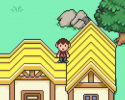
- you can walk on the righthand-side of the yellow building's roof, while on the left-hand side, you can't - but part of the roof isn't above the player. Same with the higher parts of the roof on both sides

- farmer's building roof can be walked on - tall part from the right-hand side

- road that leads north has visible void on the left

- you can phase in and out of multiple trees to the north, mostly those next to the rocks whose upper part is walkable and on higher priority

- before you reach the warehouse, two trees on the southern part of the map are missing a part

- part of the farmer's house roof on the left, the one that's protruding, does not appear on top of the player. That's likely because the lower part has like 5 pixels taking an entire tile, so the upper part is just an extension of that, so if you set it to priority both the wall and the roof will appear above player. To fix it, simply adjust the wall so that it ends at exactly 1 full tile, and upper room and roof can extend safely beyond that with higher priority.

- npcs if you get back into where the woman has been injured still have no dialogue even in act 1

- if you talk to michael from the left side, he turns with his walking pose on

- richard "unnecessary" instead of "unnecissary"

- one corner tile right as you start going north from town is showing above the rock due to it having priority

- Diner wall tiles next to door have the same buggy behavior

- "capsule" instead of "capsul"

- Tammy has priority over the counter where she is supposed to be standing behind

- "other townsfolk" instead of "other towns folk"

- the diner is closed message is missing a full stop. Store too. Door is locked for all other houses too.

- southern part of nighttime act 1 is missing it's connected map entirely, you can see the void way before you reach the edges

- nighttime act 1 suffers from the same tile problems as the other maps. What if you make it all happen on 1 map, using variables or switches instead? as it is, it must be excrutiating to fix all tile bugs three times over!

- act 2 forest map has visible cut tiles on the leftmost side

- rightmost side, where the old tree blocks you from progressing further east along the tracks, "takes" two tiles over said tracks, where you can actually walk on

- the map suffers from many of the tile problems from act 0

- interiors have the same problems, as they are copy-pasted versions of their act 0 and 1 maps

- "did not save" message is missing a full stop

- there is a "missing"corner, with small rocks in its place instead, forest map, to the left before the stairs

- if you interact with any of the notes left by Ben from a direction other than down, the event "moves" to face you, therefore becoming transparent because the character graphic only has its down direction drawn. Set the direction fix to ON in the event's settings, or draw 3 more notes in the graphic.

- is take a picture literal?

- also, it'd be nice if you could remove all the vanilla essentials stuff from the various folders, as it is a pain to have to go through so many files and folders just to find something

- the safe's table changes when you obtain the key as well


On theme choice and the potential issues:

I would guess not a lot of people nowadays would know about either this particular cult, or the man whose quote you've paraphrased in the beginning, so it is expected that you will get a mixed or negative reception due to the fact that a looooot of bad things are involved. I don't know what you have in mind, or if you want to change this at all, but I'd suggest these:

1) remove any religious references. You can substitute those with a random name and implied phrases e.g. "The Conglomerate" and "insisted that I beam our great community up to Mars Hydrospheric Calculus". (Sorry if this way out of themes or tone)

2) be able to catch Ben in the Warehouse, where he has either gathered the townsfolk to do an implied but not overly atrocious act, or where he can be seen coming up with his """"plans"""" alone. The citizens could have otherwise disappeared into the woods to run away from him, or encouraged to do so by you or the other members. This means that the party, who are actually equipped to traverse forested terrain, will be able to find them later. In short, replace deaths with disappearances, and don't let these stray from being mere disappearances. The empty houses actually made me think of disappearances.

3) Alternatively, you could focus on how pressure and ""charismatic"" influence can, over time, change people. So instead of the focus being on Ben's ... other nefarious acts, you could focus on how he influences people, or forces/coerces them to follow. That way, even if you still wish for the player to not be able to stop him, at least you can easily depict the village turning on you and driving you away, or hunting you through the woods, where your experienced team can actually make a good escape.

If you are having second thoughts about it, I think it would be best to change it rather than completely scrap it, and I hope I helped a bit. Apologies if I couldn't come up with something better.

It is clear you didn't have any bad intentions when you made this game, and you have also put a lot of effort into it, so how about changing it up a bit instead?

Strong Suite: Unconventional Mapping, Atmosphere
Feel: Unsettling, Loneliness, Meta
 
Last edited:
A file-tinkering, well-mapped game (considering the difficulty of working with Mother 3 tiles), that references a disturbing and abhorrent event that happened in the late 70ies. As it stands, it may be exceedingly repulsive for a lot of players, especially given the younger demographics around the Pokemon franchise and the fangame communities, since this kind of game (both not Pokemon, and of the particular subject matter) is unexpected in these contexts. I don't know if the devs want to either scrap certain parts or alter them, considering the subject matter... but if they don't want to alter their general vision, it could be better to perhaps re-adjust certain parts, so that younger players don't get disturbed from this, irregardless of the warning. (Younger demographics generally tend to be unable to keep their curiosity abay.)


Thoughts:

- choice of mother 3 music is fitting, obviously

- the game establishes some good atmosphere at the beginning

- was there another reason you used save points, aside from mother 3 mimicking?

- you have mapped the game well, considering you had to work with the strange tilesets of mother 3 (and some from 2?)

- the edited character sprites are generally well done

- it might be better for alex and the woman to not pop in from nowhere right as you are entering brownsville

- nitpick: house doors aren't as tall as the player character

- there's a reason almost all buildings are empty... right?

- I also like my club tomato-free

- kudos for having event movement during cutscenes

- alex and simon's convo could use some pauses inbetween, perhaps some slight head movement coupled with pauses, it feels a bit continuous

- jam time constraints aside, Alex pointing out Ben's nefariousness in a manner that explicates exactly who he is, is exposing everything immediately and in a very direct way that doesn't feel natural. It'd be much easier to simply have him say "maybe their leader isn't that much of a leader after all".

- why did nobody have the idea to get back to the city/town/ where they first came from and inform the police?

- the lead up to the final events is not really there, since we didnt have enough time to connect with the characters as players. Granted this is a jam game so this is perfectly understandable. But I think some more instances where you get to witness or be a part of the townsfolk daily lives would have made it a bit better

- does the recipe do anything?

- to be honest, I thought the game glitched out in the diner, and thought the tiles were supposed to make out a pattern or something

- I kinda stumbled upon the ceasar cipher way before I did any of the stuff that led to the portrait. Then again how can you let the game know you have physically seen a picture in the folders? Same with ben's house.

- I couldn't make the image bright enough, so the brightened version helps. Not sure that you can returned a darkened image to its original brightness easily tho unless I'm being quite the noob

- Is the player expected to use RMXP to find the safe combination? Or is it somewhere in the files? Tbh there's a lot of files so I didn't have time to look through everything

- Alright, so I guess the meta of the player exploring the files in relation to the game's story is that this is how the cult leader saw the players actions as, a kind of supernatural, "outside" way to mess with his plan?

- The presentation of the events themselves could have been handled better in terms of how fast they moved, but since this is a jam game, this isn't something major. While from a story and progression perspective, the last act might feel a bit sudden in general

- Finally, considering the pacing was constrained by the time you had, I think that the two design "issues" you could address in the future would be: 1) More time to get to know the townsfolk coupled with more involvement in their daily lives, 2) ensuring that the player progress, including file tinkering, is more linear (since I skipped a couple of steps that should have been required).

- The dialogue for the most part felt natural to me, aside from the diner talk, and expo dump MC, and one other character. The characters feel real for the most part, and I do believe that fleshing them out would have made them even more alive.


Bugs:

---MAJOR----

- All buildings except for where you are supposed to go during Act 1, the Shop, lead to the PREVIOUS city map, forcing you to rewatch the shop "spying on us" cutscene all over again. If you were setting story variables during those events, the game would have gotten a bit jumbled. But even if not, the player is forced to rewatch these events over and over unless they enter the right house right away.


-- Minor ---

- Part of a rock is walkable, next to the old tree on the left

- northern starting area void (I cant remember if this was a thing in Mother 3)

- when CJ and Sid are talking to each other, they are not facing each other upon player interaction

- southern part of starting area also has visible void

- road prologue southern part has visible void

- road prologue norther part of the map, all the way to the left, has visible void

- sid and cj persist as roadblocks post-"go to brownsville" cutscene, while their cutscene sprites are still sitting around the campfire, and they have no dialogue upon interaction

- walkable sofa leads to player seeing the void on the house map

- npcs in the house have no dialogue

- reflection of character visible upon approaching exit. You could fill the entire map with the grey-ish black tile that surrounds the walls, or, use a non-transparent black tile instead due to how newer versions of Essentials handle reflections on empty tiles

- daytime Brownsville map has a strange tile right as you climb the stairs where you first came from, to the left, the corner of the ledge has a higher priority than the player

- the same with the leftmost tree on the ledge right below, go all the way to the left. Also, visible void as with nighttime. Actually this ledge behavior can be seen in every ledge lower corner.

- most of the trees, as well as some ledges next to where the trees are placed all over the camp area, are walkable, especially if you come in from the top, and that leads to getting out of bounds fairly easily

- all interior maps have the same wall-black tile problem, some of them have walkable beds. Some of the lower corners are also walkable

- walkable ledge corner all the way to the right of daytime Bville leads to some OOB biz and being able to see the void

- Jim's Diner door doesn't have enter/exit SE

- Rosie's too

- house with white interior has visible black tiles before you even climb on the sofa

- "question" instead of "qeestion" when talking to Rich

- you can walk on the parts of the wall that connect to the door in the Pub. Probably other maps too

- you can walk on the righthand-side of the yellow building's roof, while on the left-hand side, you can't - but part of the roof isn't above the player. Same with the higher parts of the roof on both sides

- farmer's building roof can be walked on - tall part from the right-hand side

- road that leads north has visible void on the left

- you can phase in and out of multiple trees to the north, mostly those next to the rocks whose upper part is walkable and on higher priority

- before you reach the warehouse, two trees on the southern part of the map are missing a part

- part of the farmer's house roof on the left, the one that's protruding, does not appear on top of the player. That's likely because the lower part has like 5 pixels taking an entire tile, so the upper part is just an extension of that, so if you set it to priority both the wall and the roof will appear above player. To fix it, simply adjust the wall so that it ends at exactly 1 full tile, and upper room and roof can extend safely beyond that with higher priority.

- npcs if you get back into where the woman has been injured still have no dialogue even in act 1

- if you talk to michael from the left side, he turns with his walking pose on

- richard "unnecessary" instead of "unnecissary"

- one corner tile right as you start going north from town is showing above the rock due to it having priority

- Diner wall tiles next to door have the same buggy behavior

- "capsule" instead of "capsul"

- Tammy has priority over the counter where she is supposed to be standing behind

- "other townsfolk" instead of "other towns folk"

- the diner is closed message is missing a full stop. Store too. Door is locked for all other houses too.

- southern part of nighttime act 1 is missing it's connected map entirely, you can see the void way before you reach the edges

- nighttime act 1 suffers from the same tile problems as the other maps. What if you make it all happen on 1 map, using variables or switches instead? as it is, it must be excrutiating to fix all tile bugs three times over!

- act 2 forest map has visible cut tiles on the leftmost side

- rightmost side, where the old tree blocks you from progressing further east along the tracks, "takes" two tiles over said tracks, where you can actually walk on

- the map suffers from many of the tile problems from act 0

- interiors have the same problems, as they are copy-pasted versions of their act 0 and 1 maps

- "did not save" message is missing a full stop

- there is a "missing"corner, with small rocks in its place instead, forest map, to the left before the stairs

- if you interact with any of the notes left by Ben from a direction other than down, the event "moves" to face you, therefore becoming transparent because the character graphic only has its down direction drawn. Set the direction fix to ON in the event's settings, or draw 3 more notes in the graphic.

- is take a picture literal?

- also, it'd be nice if you could remove all the vanilla essentials stuff from the various folders, as it is a pain to have to go through so many files and folders just to find something

- the safe's table changes when you obtain the key as well


On theme choice and the potential issues:

I would guess not a lot of people nowadays would know about either this particular cult, or the man whose quote you've paraphrased in the beginning, so it is expected that you will get a mixed or negative reception due to the fact that a looooot of bad things are involved. I don't know what you have in mind, or if you want to change this at all, but I'd suggest these:

1) remove any religious references. You can substitute those with a random name and implied phrases e.g. "The Conglomerate" and "insisted that I beam our great community up to Mars Hydrospheric Calculus". (Sorry if this way out of themes or tone)

2) be able to catch Ben in the Warehouse, where he has either gathered the townsfolk to do an implied but not overly atrocious act, or where he can be seen coming up with his """"plans"""" alone. The citizens could have otherwise disappeared into the woods to run away from him, or encouraged to do so by you or the other members. This means that the party, who are actually equipped to traverse forested terrain, will be able to find them later. In short, replace deaths with disappearances, and don't let these stray from being mere disappearances. The empty houses actually made me think of disappearances.

3) Alternatively, you could focus on how pressure and ""charismatic"" influence can, over time, change people. So instead of the focus being on Ben's ... other nefarious acts, you could focus on how he influences people, or forces/coerces them to follow. That way, even if you still wish for the player to not be able to stop him, at least you can easily depict the village turning on you and driving you away, or hunting you through the woods, where your experienced team can actually make a good escape.

If you are having second thoughts about it, I think it would be best to change it rather than completely scrap it, and I hope I helped a bit. Apologies if I couldn't come up with something better.

It is clear you didn't have any bad intentions when you made this game, and you have also put a lot of effort into it, so how about changing it up a bit instead?

Strong Suite: Unconventional Mapping, Atmosphere
Feel: Unsettling, Loneliness, Meta
Hey! Thanks for playing, and I'm glad that you liked some portions of the game. I think you hit the two main things that I would have changed story-wise. Firstly, I really wish that I would have had more time to develop all of the characters, as the game definitely feels incomplete without knowing the characters better. Secondly, and most importantly, I feel like I really messed up with the ending, as I got so caught up in making this game similar to the events that happened that I didn't think about how people would receive it. Thanks for all of your critiques!
 

AenaonDogsky

Arbiter of Doggos
Member
Joined
Dec 12, 2017
Posts
510
Hey! Thanks for playing, and I'm glad that you liked some portions of the game. I think you hit the two main things that I would have changed story-wise. Firstly, I really wish that I would have had more time to develop all of the characters, as the game definitely feels incomplete without knowing the characters better. Secondly, and most importantly, I feel like I really messed up with the ending, as I got so caught up in making this game similar to the events that happened that I didn't think about how people would receive it. Thanks for all of your critiques!
Hey man don't worry about it. The overall game's feeling and your attempt at something unique, along with the generally natural writing, means you have a knack for it. I wasn't really aiming to pose this as a "critique", I don't think I'm qualified for that, but I do believe that you can further develop this into a game where both the intended vision, and a story that's closer to what is expected of these games, can be merged into a cohesive unit. If you want to get even more authentic, Mother 3 does have a lot of subtext that plays with bigger themes (if you are a fan of subtext), so you can surely take a look there to get some inspiration.

And it's not always easy to consider the reception of something beforehand. I think you can "fix" number 2 easily, even if it's more patchwork than anything - just for the time being, 'till you find the time to overhaul it post-jam. I'd be interested to see how you tackle this! Instead of letting yourself feel down, go do the necessary changes and then revisit once ready. Good luck!
 
Finished Brownsville! I had a really good time!
The aesthetic of the game is extremely well-done! I've never played the Mother games, so this was my first time experiencing the aesthetic, and I think it was put to great use! The indoor maps especially stand out to me, I feel like it'd be hard to switch to mapping in a different perspective like that, but the effect pays off great! (And the music choices were all well-selected, too!)

If I hadn't seen you sharing the custom tiles when you were done with them, jelo, I genuinely would have thought they were just ripped from the game itself, you replicated the style perfectly! They all look really nice, too, I especially love the transparent doors for the diner/shop and the colors of the pub!

I thought the mechanic of talking to a character to get their opinions on others was really fun! It's definitely a great way to get a feel for character dynamics and explore relationships more, and even though you don't get to interact with them a lot, I feel like it still shows that they were given depth to them beyond just their basic role in the story!

The puzzle mechanics were really fun! I was super excited when I saw that there'd be looking around in the game files, haha, and I definitely enjoyed figuring them out!
Sidd and CJ turning to face you when they don't acknowledge you in their conversation feels a bit odd.

I think bit of rearranging the Jump to commands when first talking to Alex would be nice. (for example, after selecting help- run, it'd be better to jump back to the help options rather than back to "anything you'd like to ask about?")

The "Would you like to save?" prompt with the jam jars is unnecessary, because the "Call Save Screen" command also asks if you want to save, so I have to respond "Yes" twice to save once. (Not a big deal, of course, especially now that I know about the length of the game, but when I was starting off I was saving like, every time I passed a jar because I was worried save points would be rare lmfao)

Speaking of saving, it does still display the map's name, and it feels a bit awkward to see map names like "TownNightAct1" instead of just "Brownsville". Of course, their current names are way better for organization, and there's not many named locations, so it'd probably be easier to just modify the save screen to not display the map instead. (Similarly, the load screen shows the player's dex and badge count)

This is incredibly minor, but I don't think "insinuate" is really a word that would come up in casual conversation lol, might just be me, though.

Ben's villainy sort of came out of left field to me? I mean, obviously it was planned from the start, but I hadn't really gotten the whole "things feel off" vibe that the research team had been discussing- most of the characters seemed to feel pretty free to speak their mind - Kathy openly says she doesn't like the town, Hailey says she wishes there were more people around - and Ben's talk about the environment and deforestation didn't quite give the impression of a philosophy that would motivate his authoritarianism or mass murder- I don't think he even makes any mention of what his vision for the town is, or what his criticisms are of society that led to him forming Brownsville. Obviously he's not going to go straight into "Hey this is Brownsville where I rule over everyone and they're my slaves", but it felt odd to see him go from "Yeah, we both care about the environment!" to "Your being here is proof that the devil is after us" with not much explanation for the change.

The logistics of how the citizens are trapped in Brownsville don't really seem to be explained, either. Like I mentioned, the characters seem free to speak their mind, so it doesn't seem like it's a social pressure? And Ben's the only authority figure seen around town, there's no guards or anything like in Jonestown. One of the letters mentions that they're not given any money to buy food, but three of the town's nine buildings show the citizens in charge of food- the pub and diner serve it, and Michael specifically says he grows most of the food. Not only that, the brothers at the pub even discuss how they have an employer/employee relationship, and if Ben's the boss of the town and not giving any money, it seems weird that there would be any employers in the town to begin with. I think exploring this a little more would help the player share the research team's suspicions, as well as giving the player more of an understanding of how Ben managed to take control of the townspeople and what kind of harm they were living under.


The puzzle mechanics are all things that I absolutely love, but some of the clues to follow them felt a little lacking-

So, starting with Rose's receipt- there's not really anything that suggests the player should look at her bedside table? While "just interact with stuff until you find something" is usually a good strategy for games, Brownsville has a pretty noticeable lack of flavor text- the houses get one bookcase or fridge, and sometimes not even that. (Ironically, the only house with two pieces of flavor text, the yellow text, has one telling you not to go through people's stuff) So now that I'm in the second half, I've kind of got this impression that I shouldn't be just interacting with random objects, because I'm not going to get anything for it- my instinct when I notice Rose is gone isn't "Well, let's poke around," it's "Well, let's search for other people," because that's what's been giving me results so far. And even if I decide to try interacting with things again in the red house, I might end up getting the impression that it's the wrong path, because only the fridge and bedside table will actually do anything.

Obviously adding a bunch of flavor text to the town would be a lot of work for something this small (although it could also be used to flesh out the story a bit), but something simpler you could do would be to just add a line somewhere referencing the bedside table, so that it sticks out a bit more in the player's head. (For example, maybe Rose could tell Sue to make sure she hasn't left anything in the bedside table before she leaves)

From there, figuring out to go to the diner goes smoothly, but I didn't really pick up on the prompt to look in Tilesets- like Dogz, I had figured it was a bug of some kind and that I should still be approaching this like a normal game. And while I don't think that unique gameplay like this has to connect to a game's story at all, I do think you have a nice opportunity to mesh them together here- since the player's researching the environment, and tilesets are the game's way of making the environment, maybe they could make a comment linking the two? (Of course, just observing "the tiles on the floor are all messed up" works just as well, since it's a tiled floor, and that's probably more direct, haha)

After that, though, it's pretty easy to follow the progression! (I mean, I guess you could maybe make the argument that the filename for the cipher doesn't quite say how the cipher works, but it's pretty simple, and it's pretty clear your goal is to decipher the text) I do feel like reading the note in-game could be improved on, though- since the player can't decipher the text without copy+pasting it, having to scroll it is a bit tedious, and the game directly tells you where to look for the file, whereas the other file clues were more subtle about it.


By the way! This is totally just a suggestion, but Dogz made a mention of seeing the files in the game's folder before they were needed in-game - did you know that Essentials actually has methods for downloading a file from the web? So you could literally just run, say pbDownloadToFile("https://media.discordapp.net/attachments/861688372958330903/874877601792016405/title.png","Graphics/Tilesets/Hailey, Jim, and Kathy's portrait.png") when the player enters the diner, and it wouldn't appear in the game's files until then!

Honestly, I don't think this is necessary at all for Brownsville- people aren't usually looking in the folders you picked, and if they are, they can probably guess when they come into play- I just think it's cool as hell and I think you'd probably put it to really cool use in a future ARG-style puzzle like this!


For the purple house and pub, I was confused as to why you gave them two identical maps to find the notes in instead of just making the note events depend on their switches? It still worked fine in-game, and I don't think it takes up that much more space to do it this way, but it seems like it'd be a little easier to just have the one map.

(Note- I was playing the first version when I wrote these down, so I don't know which of them have already been fixed)

After the plan to go to Brownsville, the crew is still standing there, but can't be interacted with. If you go left, Sidd and CJ are still there. Since you're just supposed to go to Brownsville next anyways, I'd personally suggest just transferring the player to the map directly.

Same is true for the Next morning cutscene and the NPCs in Rose's house.

Most of the houses have the doors open as the player enters, but the red and yellow houses (to the left of Ben's) didn't in Act 1.

I had that issue with the diner cutscene not loading, but that was brought up in discord so I think it's been fixed in v2.


1630038745977.png

Michael is midstep when interacting with him from the left


The player doesn't turn to face Tammy as they hand them the gauze and rubbing alcohol

In the Act 1 epilogue, Alex suggests "(player) or someone can go check", and then the player says "Sure, I can go, too."

When the player enters the town in Act 2, there's no name window for their dialogue
1630038641060.png
1630038711208.png

Visible void
1630038724304.png

The void in the houses leads the the player's reflection being seen as they exit doors

1630038548316.png

Alignment issue

1630038554708.png

Player sort of clips through here, I think the best solution would be increasing the priority of the tiles
1630038589341.png

Layering issue

1630038602016.png

Layering issues
1630038764791.png
1630038774860.png
1630038875902.png
1630038904024.png
1630038926569.png
1630039114359.png

Passability (a lot of the south border of the forest in Act 2 was passable)
1630039168980.png
"If you want to run just press Z!" - comma after run
is very wise but can become - comma after wise
come with me Simon? - comma after me
first but let's make sure- comma after first
If you go this way the story will progress- comma after way
it hurts a lot too - comma after lot
sounds, good? - no comma
not doing too hot but I can - comma after hot
Oh no, That's not good - no capitalization
Oh now I remember - comma after Oh
anyway you can - any way
and this of course - comma after this
some water then - comma after water
Well that ain't great - comma after Well
stop here cause one of them - 'cause
Justin by the way- comma after Justin
ddid you want something - did
love it here but spending time - comma after here
a queestion I've been meaning to ask- question
Why are the only two restaurants in this town - I think you meant "there"? But to be honest, I'm kind of confused by the protagonist's question- if there's not that many people, makes sense there wouldn't be many restaurants, right?
A shy kid I'd say - comma after kid
unnecissary responsibilities and tasks? - unnecessary
Comeback if you - Come back
Oh my brother? - comma after Oh
Oh Hailey's daughter - comma after Oh
well mannered girl - well-mannered
When we were younger he'd - comma after younger
as a brother but... - comma after brother
pretty I'd say - comma after pretty
for our friend, Simon - no comma
all around town but normally - comma after town
ecology right now so it'll- comma after now
an important thing isn't it?- comma after thing
nevermind me - never mind
Personally it's been a while- comma after Personally
Yeah I'm pretty hungry- comma after Yeah
your wings fast otherwise - comma after fast
Alright alright- comma after first Alright
Alright y'all! - comma after Alright
All the "door is locked"/"shop is closed" messages in Act 1 are missing a period
a better place and it's amazing to - comma after place
a little uptight and they seemed to be - comma after uptight
No I didn't- comma after No
Okay then - comma after Okay
Hello research group - comma after Hello
I can go too - comma after go
help us out after all - comma after out
1 chicken wings - 1 order of chicken wings
This planet, will be destroyed - no comma
key labelled warehouse - "warehouse" should be in quotes
Are we to blame? Am I to blame? - I think you only wanted the "I" italicized
I guess, I'll never really know - no comma
 

Attachments

  • 1630039138122.png
    1630039138122.png
    27 KB · Views: 178
Back
Top