• Do not use Discord to host any images you post, these links expire quickly! You can learn how to add images to your posts here.

Iron Mapper IRON MAPPER: Trial I

Status
Not open for further replies.

SimplyPixelizing

Rookie
Member
Joined
May 7, 2017
Posts
1
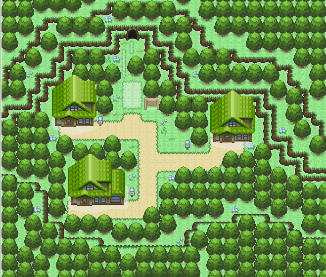
Map Name: Humhill Village
Trial: New Beginnings!
Map:
humhill_village_remake_by_simplypixelizing-db8gpux.png
Critique Requested: Of course!
Credits: http://simplypixelizing.deviantart.com/journal/POKEMON-MAP-TILE-CREDITS-625439605
Notes: For this trial, I drew inspiration from one of my earlier maps to signify a new version of the beginning of my mapping journey! I wanted to include a variety of biomes in this, but unifying them all under a very lush theme throughout. I wanted to show my personal style for the first challenge as well. For the storyline, this is a quiet calm village at the meeting place of multiple areas. To the north is the mountains, south is a beachy area, and east and west is forest. Many trainers fly here to start their journey, due to it leading to many locations.
 

Zuko

Fire Bending Prodigy
Member
Joined
Apr 1, 2017
Posts
6
Map Name: Tomir Village
Trial: New Beginnings
Map:
02fb4285b6ee00f3bb57b7519f6a4103.png

Critique: I don't really care
Credits: Tileset name is "Calis Projects and Dew Tileset by Gaolivier
I changed tweaked some tiles here and there though
Notes: eghhh I just started mapping and this is what I came up with.
 

Jester Blue

Rookie
Member
Joined
May 6, 2017
Posts
9
Map Name: League In Progress
Trial: Trial I. New Beginnings
Map
:
BlHVxU7.png
Critique Requested: Yes please. Particularly of the unfinished building and tiles.
Credits: Pokemon Essentials tiles plus a set I made myself (using Essentials tiles as a base)
Notes: I found this forum like yesterday and wanted to get in on this. Unfortunately, tomorrow is a final and move out, so I don't have nearly the time I would like to work on this. I still made custom tiles, though I ran out of time to get NPCs in. The area to the right of the construction is more than a little barren - I would have liked to made the tiles to put a tower crane in there, but I don't have the time this round.

In application, the player approaches from the right if they come here too early - an NPC would be there to explain the blockage. When approaching from the left later on, the player can see the building in progress. After the player has gone through some of the postgame, the building would be completed, giving the player access to the most challenging set of battles the developers could come up with.

Made using Tiled, 3 layers.

0IPdvaR.png
 

kirlial

Novice
Member
Joined
May 8, 2017
Posts
25
Hello! Probably a little late - I only just discovered the mapping competition so it's probably a little rushed.Regardless, it was rather enjoyable to create.
Trial: 1 New Beginnings
6r7nrHm.png
Critique Requested: Yes please!
Tileset found here: http://www.deviantart.com/art/Outdoor-tileset-664047119 Credits to Evolina, Magiscarf, Peekychew, Shawn-Frost, EnglishKiwi, Alucus and Speeddialga.
 

Hukon

Background character
Member
Joined
Apr 1, 2017
Posts
15
Map Name: Daycare Town. Man I'm creative.
Trial 1, new beginnings
bA91guY.png
Critique Requested: Yas.
Credits: Maruno, Poccil, Flameguru. The tileset is the essentials default.
Notes: I made this map like a week ago and decided to wait on submitting it in case I thought of something I wanted to change. I didn't, and then I almost forgot to submit it at all. I couldn't think of anything super unique for the theme, so I decided to make it simple by making a starting town, and having a daycare instead of a lab as a cute little twist. I considered making the daycare garden thing open and allowing the player to run around in it, but I ended up not doing that because I couldn't think of a way to make the garden small enough that it didn't feel empty, while also making it open enough to seem like a playground.
 

TANGOCOYO

coyote tango
Member
Joined
Nov 27, 2014
Posts
16
Map Name: Cliffside Town
Trial: I, N E W B E G I N N I N G S
Map:
fdq5eDv.png
Critique Requested: yeeee do it
Credits: dew, enis, and uhh the bois at 'tendo
Notes: hella last minute. literally just found out about this on twitter. sorry guys.

uhhh so new beginnings...

this is a town filled with fresh starts and such! the professor here, Simon "Big C" Cypress studies berries and the effects they have on Pokémon abnormalities and such. pretty neat. berries. starting town. cool.
 

Radical Raptr

Bug Maniac
Member
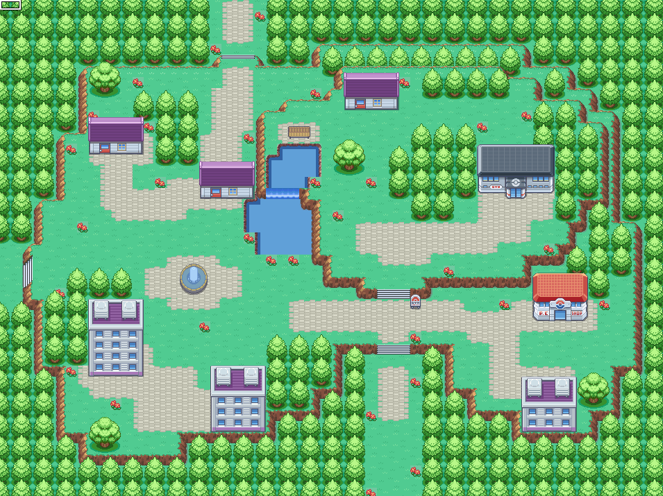
Map Name: Aikonen City
Trial: New Beginnings
Map
:
682fb83a1c98f3ba2bb75f1c18188cb0.png

Critique Requested: no
Credits: Pokemon Essentials default, Atomic Reactor
Notes: Aikonen City is the first city you visit and is home to the first gym. You enter from the bottom and have the option to advance through the region either to the left or the top and start your new adventure of the gym challenge in the region, and ultimately decide where you want to go all right here. Seasoned trainers often retire in the apartments starting their new lives here and spending time in parks with their Pokemon while new trainers are starting to get their footing.
 
Last edited:
L2gQltI.png

Trial I. New Beginnings
RESULTS

Submissions: 26
Deadline: Monday, May 8th 2017
SEASON 3 DISCUSSION THREAD

Thoughts


26 entries! That's the most we've ever had for an Iron Mapper trial. Well done, all of you! We're all thoroughly impressed with the amount of entries and some of the unique maps that were entered. It was an interesting experience running a theme that's more open to interpretation, which is something we'll definitely do in the future as well.

There's no set date for the next Iron Mapper trial, but expect it soon!

Trial Champions: FredLikesWater & BluePlays


M3jBD8v.png
KP27zqQ.png


For this trial, we had so many entries we couldn't decide on just one winner.

FredLikesWater's map captures the simplicity of the early parts of a Pokémon game in an elegant way, and makes great use of the space. While it didn't really go above and beyond with a unique idea for the theme, the atmosphere and map design really shine through with this map.

BluePlays' map does something unique with the theme and runs with it. This serene map is well balanced and has just the right amount of explorable space. Something we really like is that the mapping itself does the story telling -- no explanation is necessary. Though this map is well crafted, we maybe would have liked to see two different houses used instead of the same one twice.

At the end of the day, these are two maps we would love to see in a fan game!

FredLikesWater's entry - BluePlays' entry

Critiques


- Interesting take on the theme and the placement of objects around the farm are executed well.
- Although the tree placement is a stylistic choice, could use some tightening up as it looks a bit confusing to navigate, notably on the east side.
- A balanced, consistent map with an interesting take on the theme.
- Another set of stairs to access the other level of graves would have been a welcome addition.
- The placement of different grass tiles felt a bit artifical vs natural.
- This map was not considered for the judging period as it is the same map you've posted in the Map Showcase. You may only post NEW maps for Iron Mapper.
- Interesting take on the theme and balanced map design.
- Building perspective looks very off, better intergration should be considered or reworking that portion of the map.
- 1 tile stick outs (http://i.imgur.com/vsdpG1F.png) on paths look a bit odd.
- This path transition right here (http://i.imgur.com/T5x3lxM.png) also feels a bit off.
- Arguably one of the most unique takes on the theme. The distant Earth is a nice touch.
- The map design itself feels rather plain.
- The perspective on the missile looks off; an adjustment of one or two tiles north should be considered.
- Neat take on the theme, the idea of a town torn apart was an interesting one along with the backstory you provided. It also has some interesting objects in it.
- That being said, there's a lot of unnecessary space on the map notably on the east side.
- Typically with walkable areas on mountains, you'll want to use a different tile than the top of the mountain. This is so the player can easily distinguish what's accessible and what isn't, along with looking a bit better in general. (less repetition visually)
- Really cool and clever take on the theme. Tree shadows are also on point.
- Map feels a bit too big, even for an egg hatching/daycare route.
- A little too heavy handed on the flowers, especially by the main path.
- Map feels off with the tall grass all being on the lower level and none on the higher level.
- Empty space at the very top of the map feels like a bit of a wasted opportunity for a few small details.
- This map doesn't really match the theme of the trial very well.
- Excellent generation one mapping, you've nailed the style down. Map design is on point too.
- Consider converting part of the fences from the row by the side of the Pokémon Center to be ledges; would let the player jump down for convenience.
- Also consider adding something up in here (http://i.imgur.com/7wkezCu.png) or blocking it off a bit earlier, it feels a bit unnecessary to have it that open.
- Unique take on the theme as it just not relates to the area you mapped, but entire setting/region where the map is located.
- The pavement placement feels a bit erratic; while the final battle would have obliterated the house, some of the pavement should probably resemble the layout of the map beforehand.
- Assuming this is relatively soon after the battle, it feels a bit empty. Some more rubble would have been a nice touch.
- Simplistic cave design; yet you pull it off really well. A good balanced map.
- The white rock doesn't blend well with the other rock and clashes with it in our opinion.
- While the map sort of works with the theme, it could have been worked into the map a bit better. (eg. adding some mining equipment & tracks underwater)
- Map feels way too busy with all of the details & objects. (eg. flowers, beach objects, etc)
- The pavement path on the beach (http://i.imgur.com/oZGp9Uy.png) feels like an odd choice.
- The map feels very open and large. While this makes sense given what the map is for, it still feels like it could have been tweaked a little more to be more interesting. There unfortunately isn't a whole lot for us to comment on with it.
- Map feels a bit too open; the open space feels like it can be better utilized.
- The layout is very simple. While simple layouts aren't necessarily a bad thing, a different layout might help it stand out more.
- Some of the object placement (notably the signs) feel off/in weird places. Signs should ideally be placed in high traffic areas if they're a larger sign.
- Having a daycare in the starting town is a neat idea.
- Map feels a bit too large and open. Compressing some of the larger areas would be ideal.
- Adding some tree shadows would really spice this map up and help it stand out a little more.
- Solid map design, this is a very balanced map.
- Feels a bit odd to have three big signs in such a small town, maybe consider swapping one or two to be smaller signs.
- Some of your tree tiles have the side tiles missing, notably in the south east corner.
 
Status
Not open for further replies.
Back
Top