• Do not use Discord to host any images you post, these links expire quickly! You can learn how to add images to your posts here.

Map New Pewter City + Cerulean City reworks

This thread's author wants feedback on a map. Be constructive.

Eaglit

Novice
Member
Joined
Dec 20, 2023
Posts
41
Screenshot (826).png
Not finished right now, but I want some feedback on what I should change. Just for something I'm making for my friends but I wanna put actual effort into map design! I already know I should probably fix the path to the route being grass and make it water but I want some other ideas.
 
Upvote 0

wrigty12

Tester-Coder Hybrid
Member
Joined
Jul 24, 2022
Posts
547
Wholistically, this is an interesting take on Cerulean! It definitely could use a bit of polish to make it really shine.

1) The paths lack depth. You should look into adding some legs that visibly go into the water so it looks like the paths are just above the water.
2) The buildings look out of place just floating above the water in some places. Maybe my #1 suggestion would help there, too.
3) Make sure to go through and touch up the details, like some missing coastal portions under the mountain in the top left, or under the house on the coast on the top right.
1708757667240.png
1708757683706.png
 

Eaglit

Novice
Member
Joined
Dec 20, 2023
Posts
41
Wholistically, this is an interesting take on Cerulean! It definitely could use a bit of polish to make it really shine.

1) The paths lack depth. You should look into adding some legs that visibly go into the water so it looks like the paths are just above the water.
2) The buildings look out of place just floating above the water in some places. Maybe my #1 suggestion would help there, too.
3) Make sure to go through and touch up the details, like some missing coastal portions under the mountain in the top left, or under the house on the coast on the top right.
View attachment 26376View attachment 26377
Legs like what
Any ideas/examples?
Also I did touch up the map a lot, I'll send the changes later
 

wrigty12

Tester-Coder Hybrid
Member
Joined
Jul 24, 2022
Posts
547
Legs like what
Any ideas/examples?
Also I did touch up the map a lot, I'll send the changes later
1) Doll legs! No I'm kidding, the legs/supports that are in the base tileset:
1708808677591.png


2) An expanded wooden base or something beneath it maybe?
 

LinKazamine

Champion
Member
Joined
May 24, 2023
Posts
674
Maybe have something bellow the bikes? They seem to be floating in the water or the air.
1708809761618.png
 

Eaglit

Novice
Member
Joined
Dec 20, 2023
Posts
41
Made a few changes
Brock is just there as a test NPC don't worry about him
 

Attachments

  • Screenshot 2024-02-24 152853.png
    Screenshot 2024-02-24 152853.png
    128.3 KB · Views: 49

wrigty12

Tester-Coder Hybrid
Member
Joined
Jul 24, 2022
Posts
547
It's looking better!
Be consistent about using the shadows under all the bridges though. You have them on most of them, but some don't (Paths to the left and right).

I also feel like there's an overuse of the plank-style walkways. Try to use the planks as connection walkways, and the solid wood square platforms as intersections or larger areas. Think about how they would be designed in real life, too, as that will make it feel more realistic.
 

Karthik_

Elite 4
Member
Joined
Jul 16, 2020
Posts
109

Eaglit

Novice
Member
Joined
Dec 20, 2023
Posts
41
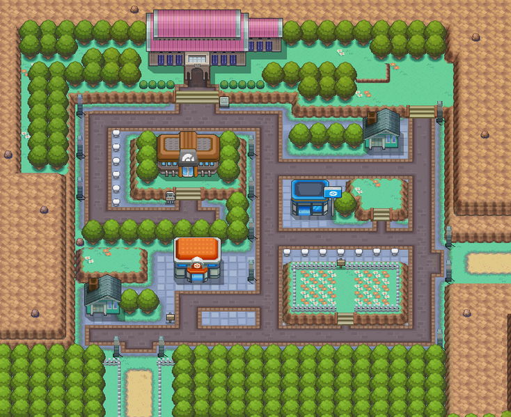
New Pewter City!
I feel like I did a little bit better than last time, but I could always use feedback!
 

Attachments

  • Screenshot (827).png
    Screenshot (827).png
    298.3 KB · Views: 51
  • Screenshot (828).png
    Screenshot (828).png
    280.6 KB · Views: 51

wrigty12

Tester-Coder Hybrid
Member
Joined
Jul 24, 2022
Posts
547
I think I agree with A.I.R. The town itself feels quite spread out and empty. I'd also recommend trying to make the town borders not a square (I know that's similar to how it looks in FRLG, but still, square towns need a bit more variety for their border shape).

Take a look at how Pewter looks in HGSS, to make it feel more "filled"
734px-Pewter_City_HGSS.png


As for the upper part, it feels a bit better, but the grasses being scattered like that does feel off.
 
Back
Top