Upvote
0
-
Do not use Discord to host any images you post, these links expire quickly! You can learn how to add images to your posts here.
-
Reminder: AI-generated content is not allowed on the forums per the Rules and Regulations. Please contact us if you have any questions!
You are using an out of date browser. It may not display this or other websites correctly.
You should upgrade or use an alternative browser.
You should upgrade or use an alternative browser.
UI custom battle UI
- Thread starter srcwolf1
- Start date
This thread's author wants feedback on a user interface. Be constructive.
- Joined
- Nov 17, 2023
- Posts
- 26
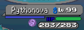
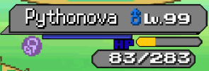
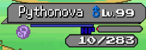
It's very disconnected. Name/sex/level aren't aligned at all, the backing is very basic. Poison lacks a border like the other UI elements. HP text blends into the background, the health bar lacks definition. How does the raw HP number look at lower values, would it have empty space at the start before health pools hit that third digit? If the blue bar is EXP, I can't tell if that screenshot is full or empty. Why is the EXP bar longer than the health bar?
Overall looks rather amateurish.
its my first time doing it. i re-did it hour ago i set the xp full to see what would look likeIt's very disconnected. Name/sex/level aren't aligned at all, the backing is very basic. Poison lacks a border like the other UI elements. HP text blends into the background, the health bar lacks definition. How does the raw HP number look at lower values, would it have empty space at the start before health pools hit that third digit? If the blue bar is EXP, I can't tell if that screenshot is full or empty. Why is the EXP bar longer than the health bar?
Overall looks rather amateurish.
Attachments
Last edited:
Having HP be blue makes it seem closer to being attached to the EXP bar. I would choose a different color.
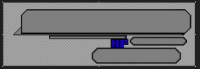
The biggest issue I have is the inconsistent pixel size being used. By default, Essentials UI has the images created where a "pixel" is actually 2x2 pixels. Half of your UI is using that default UI (like the text; the status icon also does). But your custom background stuff is using 1x1 pixels.
The biggest issue I have is the inconsistent pixel size being used. By default, Essentials UI has the images created where a "pixel" is actually 2x2 pixels. Half of your UI is using that default UI (like the text; the status icon also does). But your custom background stuff is using 1x1 pixels.
make the background outline 2x2 pixels? still learning lol want to make something and not get something from onlineHaving HP be blue makes it seem closer to being attached to the EXP bar. I would choose a different color.
The biggest issue I have is the inconsistent pixel size being used. By default, Essentials UI has the images created where a "pixel" is actually 2x2 pixels. Half of your UI is using that default UI (like the text; the status icon also does). But your custom background stuff is using 1x1 pixels.
- Joined
- Mar 29, 2019
- Posts
- 1
2x2 is basically just a thicker outline, like wrigty said it's the default essentials uses so overall your ui would blend in better with the other ui and the trainers/pokemon sprites since they use 2x2 pixels too. it does make it chunkier and you can't make as precise of details but it would come together a lot better over using 1x1. if your editing program has a grid setting you could set the grid to 2x2 to help you out a bit, i think you have a neat concept though! i would agree maybe change the hp to a different color, maybe white or a lighter color and possibly give the status effects an outline so they're a little easier to see.

